请收下这份CSS元素居中终极指南
心悦琴 -

行内元素特征:
(1)宽高就是内容的高度,不可以改变
(2)对margin仅设置左右方向有效,上下无效;padding设置上下左右都有效,即会撑大空间
(3)和其他元素都在一行,不会自动进行换行
(4)行内元素只能行内元素,不能包含块级元素
(5)可通过 display:inline 转换成行内元素
常见的行内元素:
button、img、 input、label、span、textarea、select(下拉列表)....
若是行内元素,给其父元素设置text-align:center即可实现行内元素水平居中
<div >
    <span >居中</span>
 </div>

<style>
    .parent {
      background-color: rgb(73, 40, 165);
      text-align: center; /* 水平居中 */
    }
    .child {
      color: #fff;
      background-color: rgb(16, 190, 16);
    }
</style>
块状元素特征:
(1)能够识别宽高,宽度没有设置时默认为100%
(2)margin和padding的上下左右均对其有效
(3)可以自动换行
(4)多个块状元素标签写在一起,默认排列方式为从上至下
(5)可通过 **display:block** 转换成块状元素
(6)块级元素中可以包含块级元素和行内元素
常见的块状元素:
div、p、ul、ol、li、aside、h、form、table 等语义化标签....
2.1 宽高固定当宽高固定时,以下HTML示例:
<div >
    <div ></div>
</div>

<style>
    .parent {
      height: 100px;
      background-color: aqua;
    }
    .child {
      width: 100px;
      height: 100px;
      background-color: blueviolet;
    }
</style>
添加上以下四种CSS方式都能达到水平居中的效果:

<style>
  .child {
    margin:0 auto;
  }
</style><style>
.child {
position: absolute;
margin-left: -50px;
left: 50%;
}
</style>calc() 函数用于动态计算长度值。
需要注意的是,运算符前后都需要保留一个空格,例如:width: calc(100% - 10px);任何长度值都可以使用 calc() 函数进行计算;calc()函数支持 "+", "-", "*", "/" 运算;calc()函数使用标准的数学运算优先级规则;<style>
.child {
position: absolute;
left: calc(50% - 50px);
}
</style><style>
.child {
position: absolute;
left: 0;
right: 0;
margin: 0 auto;
}
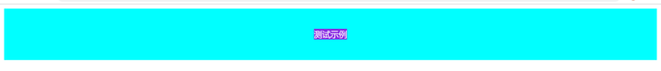
</style>当宽高不定时,以下测试示例:
<div >
  <div >测试示例</div>
</div>
<style>
  .parent {
    height: 100px;
    background-color: aqua;
  }
  .child {
    background-color: blueviolet;
    color: #fff;
  }
</style>
以下三种方式显示效果均为:

transform 属性允许我们对元素进行旋转、缩放、移动或倾斜。
translate(x,y)定义2D变换
translate3d(x,y,z)定义3D变换
<style>
.child{
    position:absolute;
    left:50%;
    transform:translate(-50%,0);
}justify-content属性定义了项目在主轴(水平)上的对齐方式。
justify-content可取值:
flex-start(默认值):左对齐flex-end:右对齐center: 居中space-between:两端对齐,项目之间的间隔都相等。space-around:每个项目两侧的间隔相等(类似margin-left = margin-right)。所以,项目之间的间隔比项目与边框的间隔大一倍。<style>
.child{
display:flex;
justify-content:center;
}
</style>
<style>
.child{
    width:fit-content;
    margin:0 auto;
}
fit-content 是 CSS3 中给width属性新加的一个属性值,它配合margin可以轻松实现水平居中。
HTML示例:
<div >
  <span >测试示例</span>
</div>
<style>
  .parent {
    height: 100px;
    background-color: aqua;
    text-align: center; /* 水平居中 */
  }
  .child {
    color: #fff;
    background-color: blueviolet;
  }
</style>
添加以下五种方式的css代码即可实现垂直居中的效果
单行文本
设置 line-height<style>
.child{
line-height:100px;
}
当多行时样式会错乱,需要用到 vertical-align:middle布局
多行文本
方式一:display : table-cell + vertical-alignvertical-align 属性设置元素的垂直对齐方式。
vertical-align属性可被用于两种环境:
使行内元素盒模型与其行内元素容器垂直对齐。例如,用于垂直对齐一行文本内的图片:
垂直对齐表格单元内容:
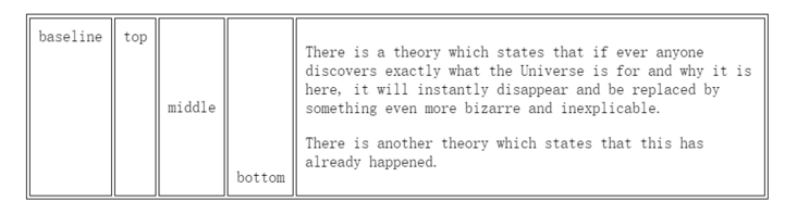
然而,vertical-align 只对行内元素、表格单元格元素生效,不能用它垂直对齐块级元素,所以,vertical-align属性只有在父层为td或者th时,才会生效,对于其他块级元素,如div、p等,默认情况是不支持的。
为了使用vertical-height,我们需要设置父元素display:table,子元素display:table-cell;vertical-align:middle;
<style>
.parent{
    display:table;
}

.child{
    display:table-cell;
    vertical-align:middle;
}
</style>
设置幽灵节点的高度以及幽灵节点的基线(通过line-height),来设置幽灵节点的x-height,是span的中线与幽灵节点的中线对齐,同样也可以使vertical-align:middle;居中
<!DOCTYPE html>
<html lang="en">

<body>

<div >
  <span >测试示例测试示例测试示例测试示例测试示例测试示例测试示例测试示例测试示例测试示例测试示例测试示例测试示例测试示例测试示例测试示例测试示例测试示例测试示例测试示例测试示例</span>
</div>
<style>
  .parent {
    height: 100px;
    background-color: aqua;
    text-align: center; /*水平居中*/

    line-height: 100px; /* 通过 line-height 设置幽灵节点的基线 */
  }
  .child {
    color: #fff;
    background-color: blueviolet;
    vertical-align: middle;

    line-height: normal;  /* 重点,要把 line-height 设置成 normal, 要不然会继承100 */
    display: inline-block;  /* 块级元素时需要加,使其拥有行内元素的特性 */

  }
</style>
</body>
</html>
writing-mode 属性定义了文本在水平或垂直方向上如何排布。
<style>
.parent{
    writing-mode:vertical-lr;
}

.child{
    writing-mode:horizontal-tb;
}
</style>
<style>
.parent{
    display:grid;
}
.child{
    margin:auto;
}

HTML示例:
<div >
  <div ></div>
</div>
<style>
  body {
    background-color: aqua;
  }
  .child {
    width: 50px;
    height: 50px;
    background-color: blueviolet;
  }
</style>
添加以下几种CSS方式均可实现垂直居中的效果。

<style>
.child{
    position:absolute;
    margin-left:-25px;
    left:50%;
    margin-top:-25%;
    top:50%;
}
</style><style>
.child{
position:absolute;
left:calc(50% - 25px);
top:calc(50% - 25px)
}
</style><style>
.child{
position:absolute;
left:0;
right:0;
top:0;
bottom:0;
margin:auto
}
</style>当宽高不定时,HTML示例:
<div >
  <div >测试示例</div>
</div>
<style>
  .parent {
    height: 100px;
    background-color: aqua;
  }
  .child {
    background-color: blueviolet;
  }
</style>
以下几种css方式都能实现以下垂直居中的效果:

需要设置parent为相对定位(position:relative)
<style>
.parent{
    position:relative;
}
.child{
    position:absolute;
    left:50%;
    top:50%;
    transform:translate(-50%,-50%);
}<style>
.parent{
display:flex;
height:100%;
justify-content:center; /*水平居中*/
align-items:center /*垂直居中*/
}
</style>关注我的公主号:昕之一方,欢迎交流~
参考资料:CSS 实现元素水平垂直居中的 N 种方式
文中所涉及代码:https://gitee.com/xin-yue-qin/center_style
Tags 标签
htmlcss前端css3html5扩展阅读
HTML5离线存储
2020-03-06 14:13:06 []wamp配置局域网访问
2020-09-04 01:12:17 []接口测试工具apipost3.0版本对于流程测试和引用参数变量
2020-09-15 15:12:13 []vs code的使用与常用插件和技巧大全总结
2020-09-17 03:07:47 []学习之apipost3.0文档移动和文档管理教程
2020-09-18 06:19:35 []分享—如何使用apipost模拟手机实现请求发送
2020-09-18 12:15:00 []【分享】apipost如何使用mock测试
2020-09-19 21:59:25 []Apipost使用技巧之分享
2020-09-19 11:44:49 [][分享] 轻松快捷完成领导要求的word格式的接口文档,再也不用因为编写word格式的接口文档而烦恼
2020-09-27 17:35:44 []【分享之】如何做好一个接口测试?
2020-09-28 18:33:39 []加个好友,技术交流
